How to Create Awesome Bottom Sheets
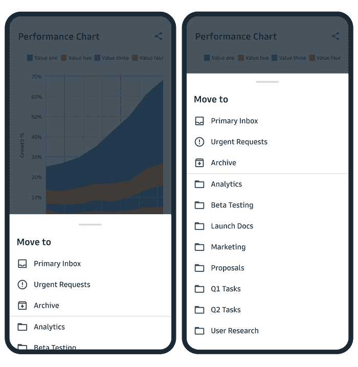
Bottom sheets are a user interface component that have become increasingly popular in recent years. They are essentially a sheet of material that slides up from the bottom of the screen and can be used to display additional content or options to the user. Bottom sheets are versatile and can be used in a variety of situations, from navigation menus to detailed information displays. They are also relatively easy to implement, making them a popular choice for many designers and developers.

However, it’s important to use bottom sheets in a way that is consistent with other elements of your design and supports the user’s overall experience. It’s important not to overuse bottom sheets, using them when required and makes sense to the user. In this article, we’ll explore some best practices for using bottom sheets in UX/UI design.
Interactivity
Interactivity is a key component of bottom sheets and can be used to engage the user and provide additional functionality. For example, a bottom sheet could include buttons, links, or checkboxes that allow the user to interact with the content. The interactivity should be intuitive and easy to use, with clear feedback to indicate what is happening during the interaction. It is also important to ensure that the bottom sheet can be easily dismissed by the user, either by tapping on a close button or by tapping outside the sheet.
Provide Appropriate Feedback
As stated above, It’s important to provide appropriate feedback when using bottom sheets. Microanimations are a common form of feedback which can play an important role in making bottom sheets feel smooth and natural. When designing a bottom sheet, consider how it will be animated in and out, consider the touch points to open and close the bottom sheet. Also remember that a standard and expected method of closing a bottom sheet is for the user to swipe down from the top of the sheet at the ‘handle’(Material design, n.d). By ensuring that the microanimations like these are smooth and consistent, this can help to create a sense of flow and continuity, making the bottom sheet feel like an integral part of the overall design.

You should also consider haptic feedback in the form of mini-vibrations, and auditory feedback in the form of sound effects. Providing feedback helps to reinforce the user’s actions, ensuring they understand what is happening as they interact with your app or website.
Keep Consistent with Other Elements
One of the key considerations when using bottom sheets is to keep them consistent with other elements of your design. This includes using similar styling, such as font, colour, and iconography, as well as adhering to similar design patterns and interactions. Keeping bottom sheets consistent with the rest of your design will help ensure a seamless experience for the user.
Don’t use bottom sheets on extremley wide screens(MaterialDesign, n.d)

Accessibility
Always a key factor to bear in mind whilst designing any UI is accessibility. It’s important to make sure that your bottom sheets are fully accessible and usable for all, including users with a wide variety of disabilities.(Material.io)
Ensure you important touch points such as the top handle have a touch point of at least 48px:
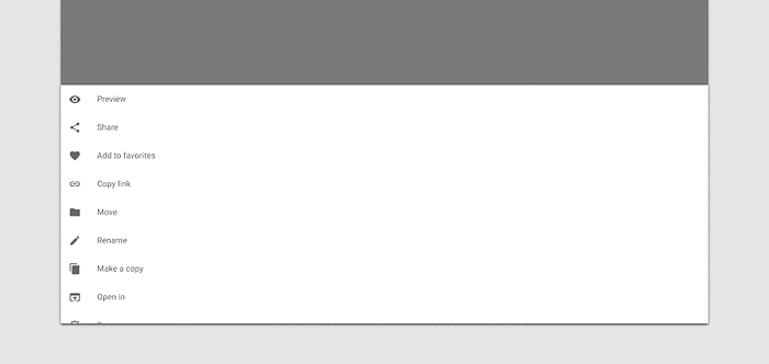
Another way to achieve great accessibility when adding bottom sheets into a design is by incorporating features such as keyboard navigation. Ensure you communicate well with the developers in your team (if you aren’t the developer yourself!) so that each action for the bottom sheet is operational via a keyboard. Material.io provides the following examples:

In addition to these points, it is important to consider basic accessibility concepts such as high contrast text for users with visual impairments. And don’t forget users who may rely on screen readers to access your app or website. Are your bottom sheets compatible?
Clear Call to Actions
The purpose of a bottom sheet is to provide additional information or options to the user, so it’s important to provide clear call to actions that guide the user in the right direction. This can be achieved by using clear, concise language and providing clear visual cues, such as buttons or links. Consider the style of call to action you are using. Is is a single primary call to action or perhaps a secondary or even a tertiary call to action.
Section Content
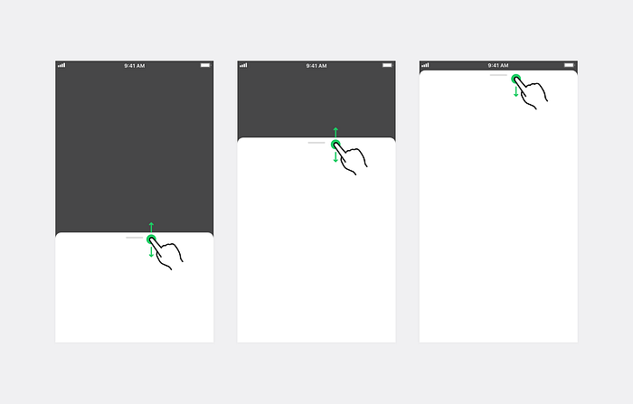
It’s also important to section or chunk the content displayed in a bottom sheet. This will help ensure that the user can quickly and easily access the information they need, without being overwhelmed by too much content. If there is a large amount of information to show, don’t be afraid of allowing the functionality for the bottom sheet to expand and cover the whole screen on scroll(LINEdesignsystem, n.d). If you need to display accessive amounts of detailed information, you should consider if a bottom sheet is the right element for the job.(Apple, n.d)
Conclusion
In conclusion, bottom sheets are a valuable tool for UX/UI design and can be used to enhance the user’s experience. However, it’s important to use bottom sheets in a way that is consistent with other elements of your design and supports the user’s overall experience. By considering factors such as interactivity, feedback, consistency and accessibility, designers and developers can ensure that bottom sheets are used effectively and enhance the overall user experience.
References
Apple. N.d. Sheets. Available at: https://developer.apple.com/design/human-interface-guidelines/components/presentation/sheets/
Line Design System. N.d. Bottom Sheets. Available at: https://designsystem.line.me/LDSM/components/bottom_sheet-ex-en
Material.io. n.d. Bottom Sheets. Available at: https://m3.material.io/components/bottom-sheets/accessibility
Material Design. N.d. Sheets: bottom. Available at: https://www.material.io/components/sheets-bottom
